Data presentation
The HKL software allows multiple data presentation methods such as maps (Tango), pole figures (Mambo), inverse pole figures (Mambo) and ODFs (Salsa). Each method is used to interrogate a specific aspect of the data. The data shown in Figures 1b-f, 2, 3, 4 and 5 are for an experimentally deformed calcite sample.
Maps
Maps can only be plotted from data collected in the XY grid mapping mode. Point data and line scans cannot be plotted up as maps. Maps are used to illustrate the overall microstructure and allow different aspect of the maps to be interrogated such as grain size variations, low angle grain boundaries, high angle grain boundaries, the type and location of twins, phase distribution, inter-phase relationships and much more. A few examples are shown in figure 2. The maps are created by using single or multiple components. Each component is designed to highlight a particular aspect of the microstructure such as the misorientation angle of the boundaries or the distribution of phases. Multiple components can be used on one map and these types of overlain maps are used to understand the inter- and intra-grain relationships.
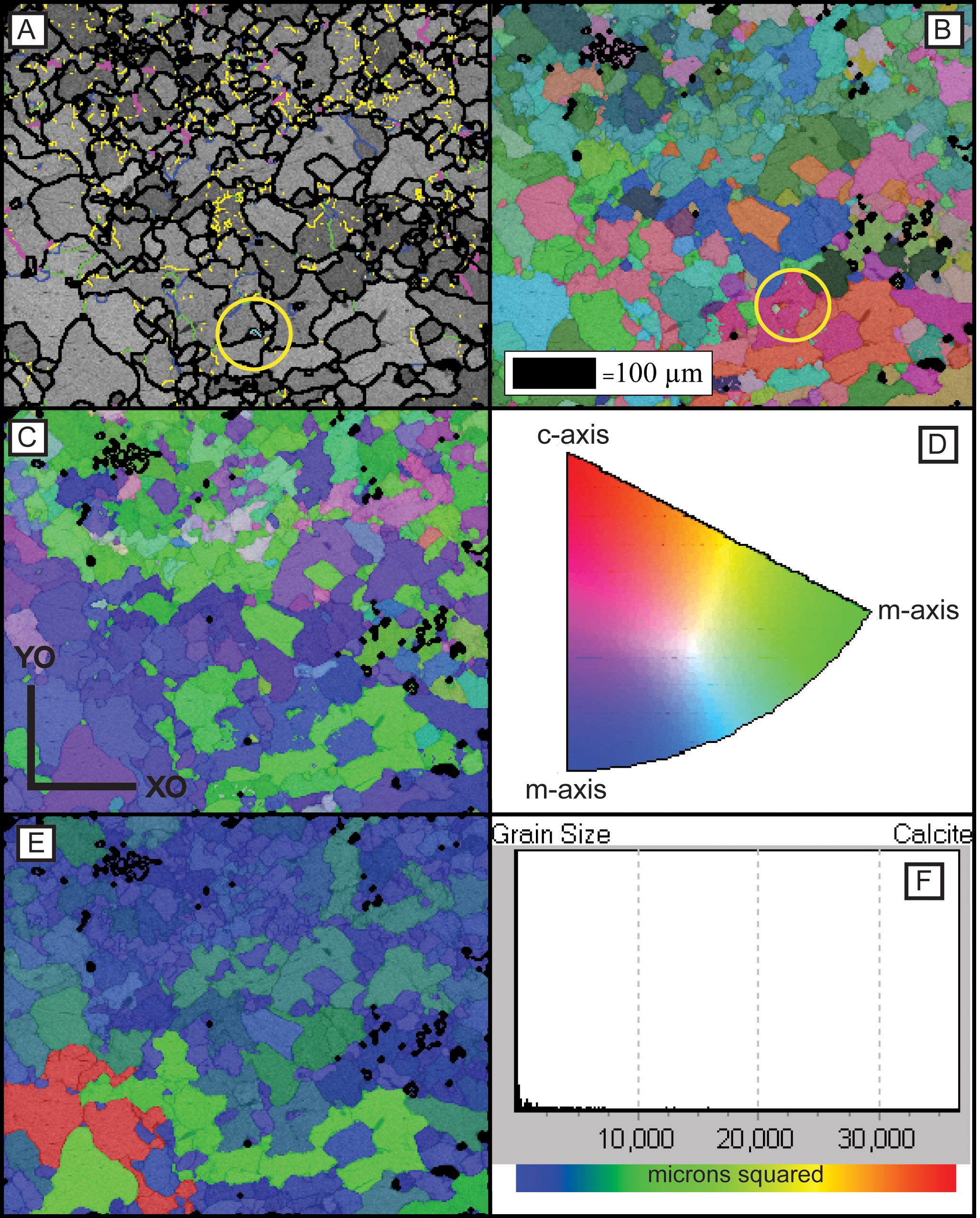
Figure 2a shows the band-contrast or pattern-quality component overlain by the boundary component, where each colour represents a defined range of misorientation angles: ≥2° = yellow, ≥5° = green, ≥10° = blue, ≥20° = pink and ≥30° = black. In the band-contrast map the grayscale of each pixel reflects the definition of the pattern regardless of index result, where darker shades are of poorer pattern quality and generally correspond to grain/phase boundaries. The signal can be affected by the diffraction intensity for the phase, the dislocation/crystallographic defect density and the orientation. The boundary component draws boundaries between map pixels where the orientation change is greater than the user defined minimum. Depending upon the phase boundaries with misorientation angles of less than 10° (different angles can be selected for different phases), are defined as low-angle grain boundaries, whereas boundaries with misorientation angles of greater than 10° are classed as high-angle grain boundaries. The boundary component shows the distribution and concentration of boundaries but it is also possible to show the percentage of boundaries which display particular misorientation angles using the misorientation angle distribution bar chart.
Special boundaries can be plotted using specific axis-angle relationships corresponding to known twin laws (Halfpenny, 2011), or phase boundaries. It is also possible to map complicated phase boundaries such as specific exsolution texture relationships. Special boundaries can also be used to determine previously unknown axis-angle relationships either between grains or intra-grain. In figure 2a inside the yellow circle is a light blue coloured boundary which represents an E-twin. The sample contains surprisingly few E-twins for a deformed calcite sample. The ability to highlight special boundaries is an important feature as the type of twinning can be used to understand the deformation mechanisms and evolution of a sample and the locations of phase boundaries can illustrate angular relationships between layers.
Figure 2. Example maps produced using HKL Channel 5 Tango software

(A) Shows the band-contrast or pattern-quality component overlain by a boundary component, where each colour represents greater than or equal to a defined misorientation angle: ≥2° = yellow, ≥5° = green, ≥10° = blue, ≥20° = pink, and ≥30° = black and also the e-twin special boundary component which colours e-twins in light blue. An e-twin example is highlighted inside the yellow box. (B) Grains coloured according to their crystallographic orientation expressed using Euler angles, φ1, Φ, φ2 semi-transparently overlain on the band-contrast component. (C) Grains coloured with the inverse pole figure component shown in figure 2D. (D) IPF crystal reference frame of colours used to produce the map shown in figure 2C. (E) Grains coloured with a grain size (area µm2) component from red (large) to blue (small) (see figure 2F) semi-transparently overlain on the band-contrast component. (F) Shows the legend for the colour scheme used in figure 2E.
Figure 2b plots grains coloured according to their measured crystallographic orientation expressed using Euler angles, φ1, Φ, φ2 (Dingley and Randle, 1992), in general similar colours indicate similar orientations and these maps are used as a display the texture of the overall microstructure. Euler maps clearly show preferred orientations and layering. Euler colouring is used in Tango to assign each Euler angle to a red, green, and blue colour and the three are combined into a single RGB colour per pixel. A full definition of Euler angles and Euler space can be found in (Wenk, 1985). In figure 1f inside the yellow circle is a deep pink grain that contains some green areas. These areas are not mis-indexed points which require removal via data processing but are actually within a couple of degrees of the rest of the grain. This “wraparound” effect is due to how the colours are assigned based on the measured Euler angles. This happens when one or more of the Euler angles are near a limit, causing the R, G, or B component to vary between maximum and minium, giving vast colour differences where little or no orientation change occurs. Due to this limitation it may be more applicable to use another colouring scheme such as inverse pole figure (IPF) colouring. It is important to note that all orientation colouring schemes have some sort of limitation.
In figure 2c, the grains are coloured according to the IPF component semi-transparently overlain on the band contrast component (for background on IPF’s, see Law et al. (1986)). The IPF colour scheme is shown in figure 2d. The inverse pole figure component uses a basic RGB colouring scheme, to fit the IPF appropriate for the crystallography of the phase. For trigonal, red, green and blue are assigned to grains whose c-axis or m-axes, respectively, are parallel to the user-defined projection direction of the IPF. In this case the map is dominated by blue and green coloured grains which have m-axes parallel to XO (the user-defined projection direction). IPF component colouring is most useful for understanding preferred orientations and viewing internal substructure. This component works on all crystal systems except for triclinic. IPF colouring is not susceptible to the “wraparound” effect but does have a limitation - two crystals which share the crystallographic axes that is parallel to the specified IPF projection direction but can possess significantly different orientations are coloured the same.
Grain size is an important parameter in understanding the nucleation and recrystallisation mechanisms a sample has been subjected to. Grain size distribution can be revealed readily via maps. Figure 2e is coloured based upon the grain size component utilizing a rainbow colour scheme from red (largest) to blue (smallest) semi-transparently overlain on the band contrast component. The legend for the colour scheme is shown in figure 2f. The map shows very few original large grains because deformation has reduced the grain size. These maps are extremely useful when analysing bi-modal grain size samples such as highly deformed samples where protolith grains will be large and recrystallised grains will be small.
Map data is extremely powerful as it allows the microstructure to be separated into subsets, so specific features can be studied. An example would be separating the data into recrystallised grains and protolith grains. In this way, grain size calculations can be performed individually for each subset and the texture of each subset can be plotted to provide information about the controlling recrystallisation and nucleation mechanism. Other common applications of subset creation involve polyphase samples where individual texture and orientation relationships can be divided into individual phases to interrogate the P-T-t path. Subsets are an extremely powerful way of interrogating the data, especially in complicated samples. Maps can also be used to study aspects of single grains, for example internal misorientation distribution. This can be used to determine the controlling slip-system(s).
Pole figures
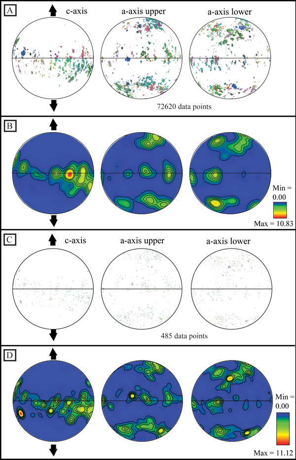
Pole figures can be plotted no matter how the data have been collected and are most commonly used for texture analysis, for confirming single crystal orientation and for studying slip systems. It is important to present data in the most suitable reference frame for the research. If the XZ kinematic reference frame is selected, then Z conventionally plots at the north position and X plots at the east position. In figure 3, the sample was deformed under extension and the data is presented with the extension direction plotting along the vertical axis and is represented by a pair of opposed arrows (Fig. 3). Figure 3a plots every measured data point from the map as point data (poles to the planes). Figure 3b shows the same data but contoured. Sometimes it is not necessary to contour the data as the texture can clearly be seen from the point data (as in this case) but at times there are so many data points that the plot is covered and no relationship can be clearly defined from the point data alone.
Figure 3. Pole figures produced using HKL Channel 5 Mambo software
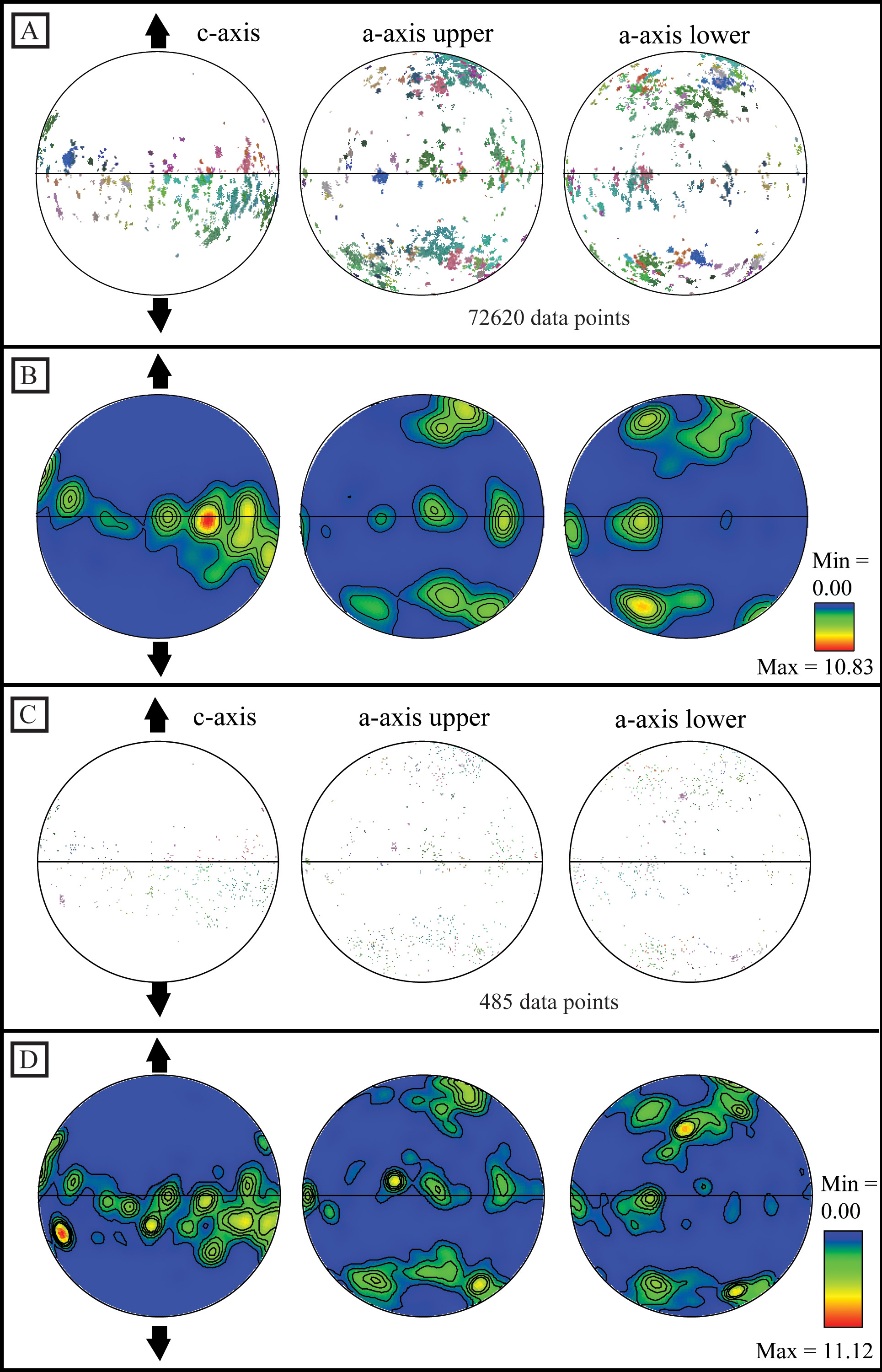
Equal area, lower hemisphere pole figures, with the experimental extension direction marked plotting: (A) Point data plot for all data points (72620), the colours correspond to figure 2b. (B) Contour plot of the same data shown in figure 3A, where the half width used is 15° and the data clustering was 5°. (C) One point per grain data for the same area (495 data points), the colours correspond to figure 2B. (D) Contour plot of the same data shown in figure 3C, where the half width used is 15° and the data clustering was 5°.
Data must be contoured to quantify the texture strength. Figure 3b exhibits a maximum texture strength of 10.83 times random, which is significant. There are other methods for comparing texture strength such as Kearns factors (Gruber et al., 2011), the J-index (Mainprice and Silver, 1993) and the M-index (Skemer et al., 2005), Kearns factors can be calculated in Mambo but to calculate J- and M- index the data has to be exported into another program such as excel. How the data is contoured is also important as it will sharpen or weaken the appearance of the contoured data but more importantly it will change the calculated texture strength. So when performing a comparison it is important to always use the same contouring conditions. Figure 3b was produced with a half width of 15° and data clustering set to 5° and plotted on equal-area, lower-hemisphere pole figures. The data in figure 3 show a-axes split into upper and lower hemispheres as required by the trigonal crystal symmetry.
The data in figure 3a and 3b were produced using every measured data point but each grain will contain multiple data points and these will cause a cluster on a pole figure. If the aim of the research is to compare texture with volume then this methodology is appropriate but single point-per-grain can be used for the analysis, to ensure the CPO is real and not an artifact of over sampling of the large grains. Figures 3c and 3d plot only one point per grain for the same areas as shown in figures 3a and 3b. The number of data points used has been significantly reduced from 72620 to 495, the number of grains contained within the mapped area. Texture strength when using all of the data points is 10.83 compared to the one point per grain value of 11.12. Also if you compare the contoured pole figure plots (Fig. 3b and 3c), 3c is a better representation of the point data and is therefore more realistic and a better display of the CPO. These are the most common methods used for creating contoured pole figure data but there are others (Halfpenny et al., 2006).
Inverse pole figures
Figure 4. Misorientation data plotted using inverse pole figures
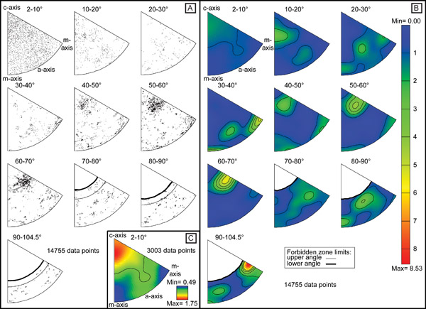
Misorientation angle/axis pair data plotted up in 10° intervals of misorientation on inverse pole figures. (A) Raw point data. (B) Contour plot of the same data shown in figure 4A, where the half width used is 15° and the data clustering was 5°. (C) Separates off the 2-10° plot and contours it singularly (contoured using the same settings as figure 4B).
Inverse pole figures can be used in place of traditional pole figures (plotting the same data as on the pole figure or highlighting fiber textures discussed in the IPF map component section) or for misorientation analysis (plotting the misorientation angle/axis data pair data relationships). For discussions on how IPF’s are generated please see (Law et al., 1986; Lloyd and Ferguson, 1986; Lloyd et al., 1987; Lloyd and Law, 1987; Randle, 1995). The data shown in figure 4 are misorientation angle/axis pair relationships. These data illustrate which axes dominate the rotation geometry and allow the determination of controlling slip systems or twin laws. Also the data can be used to indicate mechanisms that have caused microstructural modification such as grain boundary sliding.
Figure 4a shows the point data separated out into 10° slices up to the maximum allowed rotation (104.5°) due to the trigonal crystal class. Figure 4b shows the same data as in 4a but contoured using a half width of 15° and a cluster size of 5. Figure 4c is contoured using the same conditions as in figure 4b and is shown to illustrate the fact that when multiple plots are contoured at the same time, all of the plots are contoured relative to each other. If each plot is contoured individually there is no loss of data (compare figure 4c with the first plot 2-10° in 4b) and the variations can be seen more clearly. The white zones on the plots for misorientation angles > 70° are symmetry related since no rotations can exist in these zones. The data show that for internal subgrain boundaries (plot 2-10°) the rotations are around the c-axis with some rotations about the a-axes whereas at higher angles the dominant rotation axes are e and m.
Orientation distribution functions
ODF’s are used to illustrate texture. ODF’s are not commonly used in the geological sciences but are the standard viewing method for orientation analysis in materials science. There is some literature applying ODFs to geological samples: (Bunge, 1981; Bunge et al., 1989; Law, 1987; Law et al., 1990; Mainprice et al., 1993; Russell and Ghomshei, 1997; Schmid et al., 1981) but it is difficult to use ODFs to illustrate twin relationships. ODFs are more suited for studying samples where the relationship between the anisotropic properties of single crystals and the polycrystalline material are being compared (Bunge, 1981).